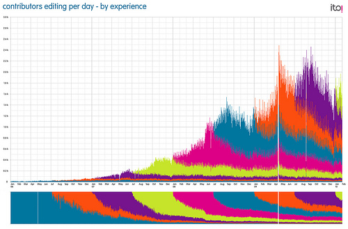
This is another very pretty visualisation of map edits from ITO!
IT shows the growth in edits and also the source timeframe. Each new colour band is 6 months worth of editors and the small natural decline over time offset by the massive growth.
Below the main chart is the relative contribution of each set of 6 months worth of users. So for example you can see the very first set of 6 months worth is now a very small proportion of the contributors overall. For more, see the flickr page here: http://www.flickr.com/photos/itoworld/4362940980