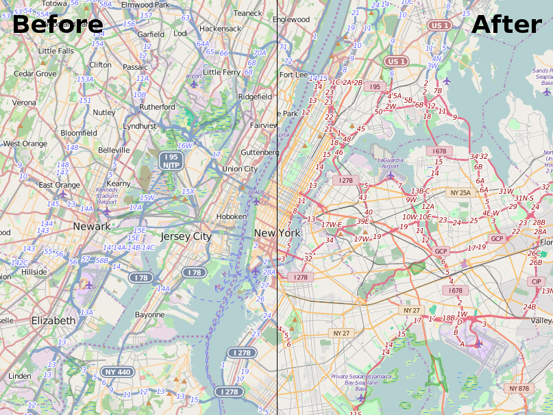
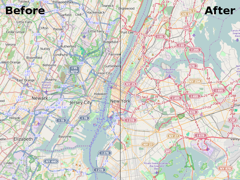
If you head over to OpenStreetMap.org and click on the layers button on the right of the map, you are provided a selection of map layers to choose from. This is possible due to the nature of OpenStreetMap – by distributing open geographic data we enable others to produce a map from OpenStreetMap data in whatever style they require. The OSM website provides five such styles but there are many hundreds, if not thousands of other styles in use across the web.
We will shortly begin to roll out a new version of the ‘Standard’ (or default) map style replacing the current version. Although the new version is an evolution of the existing version, the changes to road colours and the display of railways will significantly help to improve the readability of the map. During this roll out you may see a patchwork of old and new map style for a few hours – please be patient whilst our servers work hard to update all corners of the map.
How will the style change?
The change of the map style will primarily effect the way roads and railways are displayed. As OpenStreetMap has grown over the last 11 years we have began to collect more and more information about our surrounding environment. The standard map style has adapted to display this information, but over time this has led to the road and rail network becoming harder to identify. For example, trunk roads (currently shown in green) can be very hard to see in heavily forested areas.
In the new map style “road colours [are] tuned to ensure that roads are well visible on all landcovers”, explains Mateusz Konieczny, who has developed the new style (project details) . Mateusz has worked with the OpenStreetMap community at every step of the journey from initial research to draft implementations to gather feedback on the design. He adds that “steady progression of hue and lightness for major road types (motorway, trunk, primary, secondary, tertiary) should make more intuitive which roads are more important”.
There’s been other recent changes to the style – why highlight this one?
You’re right. For the last few years there has been a new map style released every two to three weeks. As with all things OpenStreetMap there is an army of volunteers working to fix and improve the map style. It would be great to write about all of them but that’s simply not possible. So this change, being one of the larger ones and a Google Summer of Code project, gives us a great opportunity to pause and thank all those who have contributed to the map style. Thank you style maintainers!
What next for this map style?
In the short term, it’s likely to be small incremental tweaks so as to continuously improve the map. Every big change attracts new style maintainers who bring their own ideas and experience. There may be a few minor tweaks to the paths and roads based on their ideas.
There is also an updated version of Mapnik, the underlying toolkit used to convert the written style rules in to the final map you see on the OSM website. The latest version will help to fix a lot of bugs related to non-latin scripts/languages. In the longer term there is the option to repopulate the database used by the Standard map style so that it has access to all OpenStreetMap data tags, not just a limited few.
Can I help with development of the ‘Standard’ style?
Yes. The standard map style, which is known as OpenStreetMap-Carto is available on GitHub. Andy Allan, who re-energized the development of this map style in 2012 has given a number of talks at recent OpenStreetMap conferences. Two good starting points are his talk at State of the Map US 2015 in which he gave a progress update for the project, and the detailed workshop he ran at State of the Map EU 2014.
And what about the other map styles?
Well this change only affects the ‘Standard’ (or default) layer as seen on openstreetmap.org.
There are a number of alternative map styles available or you could make your own. Perhaps you want to produce your own personal map to highlight features that are important to you, or maybe you want the map to better match your company brand. This is all possible with OpenStreetMap data. You can even take the current ‘Standard’ as a starting point.
Is it possible to add new map styles to the OSM website?
It is possible, although your style (and the hosting of it) must meet a number of criteria to be considered. See our tile layer guidelines.
“this change only effects” should be “this change only affects”
(fixed)
Pingback: 2 – The map you see on OpenStreetMap.org is changing - Exploding Ads
Pingback: OpenStreetMap.org karta se mijenja | OpenStreetMap Hrvatska
Ouch. UK perspective here – I’m now looking at the map, and until you get to zoom level 10 it’s virtually impossible to distinguish between motorway, trunk and primary A roads: you just see a web. The motorways really should standout.
http://www.openstreetmap.org/#map=6/54.098/-0.286
compared to
https://www.google.co.uk/maps/@54.3116999,-1.3931621,6z?hl=en
(totally agree with trunk green needing addressed)
And on zoom 9 it’s a mass web of roads, rather than a structured hierarchy which helps users identify the important info for that level:
http://www.openstreetmap.org/#map=9/53.2093/-1.6342
compared to
https://www.google.co.uk/maps/@53.2093,-1.6342,9z?hl=en
Yeah it is a bit less effective at zoom 9 in the UK, but the trouble is it’s a global map style, and other parts of the globe now look better at zoom 9. There’s some tricky trade-offs to make. One clever thing Mapquest Open style did, was to render different countries in different ways. The UK is treated specially because we love our blue motorways: http://www.openstreetmap.org/#map=6/53.632/-1.099&layers=Q Mapquest Open is generally a bit more heavily motor-oriented. Therein lies another eternal tension. Who is the map for? Personally I like the way the national parks seem to stand out better now.
Speaking as a Britannico-French living in the Czech Republic, having recently driven over Europe, the new style makes no sense whatsoever. The current colour match none of the current road signs I have ever seen. It feels like reading a Michelin map from the 80s. Most countries either have motorways signed in blue or green, with primary roads in either green or blue.
I’m with wangi, the new colour scheme makes the map hard to read. I am trying to differentiate roads around Prague now to back my comments and all I see is red-orange blob.
Se my village houses
One can start playing with osm-carto style installing TileMill on Ubuntu 14.04 (virtual machine can be useful if you have another version, distro or operating system) using these instructions:
https://github.com/gravitystorm/openstreetmap-carto/issues/657#issuecomment-121279334
Great point Kocio. We want more people to do this (More people experimenting with maps styles, more people posting concrete style change suggestions, more people hosting their own tile servers, and fewer people just whining about how this one tileset is looking)
Main install instructions:
https://github.com/gravitystorm/openstreetmap-carto/blob/master/INSTALL.md although those instructions are not very ‘step-by-step’ so people might prefer https://switch2osm.org/serving-tiles/
Mapquest view it is for me then – the reds and oranges isn’t an appealing map style.
You don’t like red and orange but you talk about changing to the mapquest style????
Yes, because as Harry explains above, Mapquest Open’s colouring is country-specific.
IMHO, that’s particularly ugly and confusing. Finding a global compromise as you’re doing in the default rendering is much better, even if it means some countries will not have their favorite colors.
It would be better for tertiary roads to have a color, not white, because it’s not easy to identify.
Yes. This was heavily discussed aspect of the road colouring changes for sure. A lot people saying the same. But I think the aim here was to reduce the number of different colours going on. Personally I think we should phase out the use of highway=tertiary within the data too since we’ve got too many different road tags… but that might be a bit controversial 🙂
I’d also like the tertiary roads to have a separate colour, they are hard to identify now from “residential”.
And on highway=motorway, the “ref” tag now is rendered far too seldom when there’s also a “name” tag.
Tertiary roads deserve some small tweaks, they are clearly recognisable in all zoom levels except 13.
Hi, is there any way of keeping the old style as another option in Map Layers? I realise this change may make sense ‘internationally’, but here in the UK we like to distinguish between motorways (blue) and primary non-motorways (green), and secondary roads (yellow) rather than three different shades of red. This new style looks a bit ghastly.
Hopefully some time soon somebody on the osm-gb mailing list will say something *constructive* on the topic of setting up a tile server for this purpose. In the meantime of course there’s always MapQuest Open’s rendering of the OpenStreetMap data. That’s following UK road map colours (which is by no means the only way of choosing to colour a UK map, but the way some people are talking you’d think it was!)
Hi James
totally agree with you, I am not a born British, but I live in the UK, and for me, this new style is absolutley terrible too. The country where I used to live looks the same.So it’s not a “UK only” problem. Germany, France..etc they looks the same poor look with this less saturated color scheme.
If someone want to see parks, go to Google Satelite, or Bing.
There’s going to be some compromise because everybody sees roads differently. For people living in the US, green means a toll road, while blue means big highway. The rest are whites, yellows or reds.
Looks like it was copied straight from Google maps.
Tertiary not being distinguishable from residential/unclassified makes it much less useful for it’s primary purpose – proofreading the database.
Whereabouts are you looking mostly? Personally I think we should ease off on using highway=tertiary so much, but I don’t know if that would involve re-categorizing everything in some parts of the world.
I think tertiary is pretty common in many places for a small road that connects little towns. What would you suggest instead?
Mp of UP
Dear OSM Team,
the new layers are terrible! On the old one, I was able to see UK motorways, non trunk main roads, trunk roads, etc… but on this one, they looks very similar, easy to get confused.
Google Maps went through the same: it was clearly visible to see different road types,and they screwed it up. After that, I stopped using Google Maps(except for StreetView)
But now, OSM got screwed too !!! Useless with this layers.
Bunch of users were praying to Google to put back the old StreetView, cos they screwed that too!
What is the point? Create something good, wait until it gets popular, than screw it up…. why?
I’m very dissapointed.
Thank you,
Frank
United Kingdom
The British community had always concerns during the process of creating the map style. But it’s a national problem. Most other countries are more used to this kind of colour styling and had problems with the old UK approach.
I can understand that you are frustrated but you also have to understand that this means an improvement for others.
There are already discussions regarding an own tile server for a British map style and in the meantime the MapQuest Open Layer uses the british styling for the UK. (http://www.openstreetmap.org/#map=6/53.377/-1.340&layers=Q)
Thank you for your answer, it’s very kind, but I am not British, I am not born here, raised far away from the UK, didn’t even speak english prior my life in the UK,I don’t even have a British passport.
So this is not a “national” UK problem, it is a problem for most of the human beings living in planet Earth.
Other applications also use OSM default, those can not be changed to MapQuest. My phone has the OSM app, and on that also can not be changed to MapQuest.
Dear Hedaja,
as others said: “The less saturated color scheme makes the map less readable, ” Why good this to other communities to make the map less readable?
In my opinion, the map style is constantly getting worse. The less saturated color scheme makes the map less readable, and now with the changed street scheme there is a big loss in information again.
What I miss is work on the issues like non transparent features above tunnels or bugs around bridges, especially bridges with railroad/tram tracks.
I like the new color style. I had doubts that tertiary roads wouldn’t be distinguishable anymore but for my area they a re still clearly visible. Since they are a lot wider than residential roads.
I still see some potential for improvement on lower zoom levels.
Things that I like about the new rendering scheme on first impression:
– I think the square boxes for the road ref look much better than the previous oval/rounded-cornered ones.
– The reduced thickness of residential roads make the map much more readable, especially in neighborhoods/residential complexes where roads are very close together (in the past they would simply overlap and coalesce into a mass of white)
Some issues I’ve noticed:
– The ref tags seem not to render for long stretches of major roads (motorways/interstate hwys) or not at all in some parts: looking at Miami as an example (z12), refs for major motorways I-95, I-195, FL 112 are completely missing, and for FL 836 and FL 826 are only rendered in one place (and in the former case, only at one of its termini on the western outskirts of the city). If I were not familiar with the area, I’d say being able to locate major highways such as motorways/interstates is one of the critical aspects of an overview zoom level such as 12.
– In less developed countries, primary roads, and not motorways, make up the country’s road network of thoroughfares. Despite this major difference, primary roads in these countries are not rendered until one gets down to zoom level 8, leaving a largely blank map as far as roads are concerned for higher zoom levels. I would think the decision of when to render a road should not be so much dependent on a hard rule of zoom levels, but rather as a function of the density of objects (e.g. roads) with the same or a higher priority in the surrounding area. So for areas where there are no motorways or trunk roads, primary roads would be displayed at much higher zoom levels as there are no motorways, and so on. That would also solve the issue of different styles for different countries and prevent other issues: 1) The result of such blank maps in Colombia and Venezuela, for example, is users’ mapping for the renderer: major roads are retagged as trunk or, worse, motorway in an effort to have the roads show up on the map at higher zoom levels. And 2) It also leads to increased disputes as to the use of trunk, which from what I can tell from the Wiki, was never settled in the case of Colombia.
– Lastly, the reduced thickness for residential roads has the side effect that intersection of tertiary/residential roads which involve a tertiary_link results in the link being a different thickness than the connecting residential road, which looks a bit odd. Might just be a matter of getting used to it, but still I’d expect the link segment to be of a lesser thickness than the roads it connects.
Very very bad idea
As a major mapper (Algeria), i think that i gona stop contributing to OSM after 8 years.
This new style has destructed all the job made along the years.
Totaly impossible to destinguish between the different type of roads, is not that the most important for a MAP !
Hi Sandervalya
yes, you’re right. Totally useless with this new layout.As I mentioned earlier, this problem not only UK specific, the roads are looks very similar in the new layout,and you have the same problem in your country too.
Why online comapnies deliberately screwing up their product?
-Google Maps (went through the same few months ago)
-Google StreetView (new map view very slow on old computers)
-Firefox Browser(too small side bar,but later fixed)
-OSM default(also screwed with new poor layout)
Why?
I actually think it’s generally an improvement with a couple exceptions, all based on distinguishing things.
In places like Uganda, where I do a lot of mapping, I much prefer the new scheme, but in places like New York or the UK, which have a robust road hierarchy, I have a very difficult time distinguishing major roads from other major roads. It is also difficult to distinguish railway lines from tertiary roads at specific zoom levels.
I’d propose the following changes:
– adding a “purple” colour for motorways – this would continue a gradient scheme but also reflect motorways tend to have a very distinctive effect on the way one views a city, i.e. in aerial photos – and perhaps moving primary roads up to the red the motorways currently are;
– making railways darker or more distinguishable.
All in all though good work
@Sandervalya first the changes have been discussed in public since months now. 2nd there is no shortage of ofther map styles, for example the Humanitarian style and the French one http://tile.openstreetmap.fr/
In any case whatever you contribute to OSM it should be completly independent of what ever is the current default map style on openstreetmap.org, so nothing has been or could have been “destroyed”.
Hi Simon,
It depends on how you think OSM is. If you think that it’s only data footage for the use of some tech and hight profile users ok
But what i see is that you forget that the main OSM site and it default map style are an alternative general public map to Google Maps. The Mapnik style with it colors was definitively different, more beautiful, easier to read and understand for a layman.
Now it’s just the same as Google Maps etc..
While a lot of this is simply a matter of taste, one thing is sure: the new style version isn’t at all like google maps. See http://mc.bbbike.org/mc/?lon=-0.127647&lat=51.507322&zoom=9&num=2&mt0=mapnik&mt1=google-map&marker=London,%20Greater%20London,%20England,%20United%20Kingdom
Finaly you’re right, now Google Maps seem realy better to see at a glance.
Hi Simon,
thank you for the French OSM link, that is remained the same.
http://tile.openstreetmap.fr/
Deja Vu.
i dont like more wish fix china county dsipaly problem
I like this new style, works really well in small zoom number in Indonesian urban cities (Jakarta looks much cleaner), yet it seems we need to wait until all the tiles updated and distributed in all OSM servers.
Changing is good but still very subjective. I know it is really hard to apply a new basemap design which suits for everyone needs. However, I kinda like the new colours.
Btw, there is a research from one of GIS students at the University of Canterbury about user interactions with digital basemap (measuring complexity and user preference). His survey link is http://canterbury.qualtrics.com/jfe/form/SV_7P5NZiBVrIAmX4x It is very related with basemap design. So maybe OSM could take some inputs from the results (at the moment it’s not released yet)?
Cheers
“For example, trunk roads (currently shown in green) can be very hard to see in heavily forested areas.”
Is that really the best reason for the wholesale change? It would be interesting to see a list of pros and cons, and per country too, which you must have gone through to have agreed that the change is better than leaving things as they were. Could you supply (a link to) this?
The pros and cons were thrashed out pretty thoroughly across several mailing list posts too, but probably best starting point for looking through the history of discussions, would be to look at this github pull request: https://github.com/gravitystorm/openstreetmap-carto/pull/1736 …and particularly the text of the pull request itself, which was carefully prepared, described and justified by Mateusz in consultation with various other folks including his GSoC mentor Paul Norman. The change has swept away a whole host of cartographic issues.
Green trunk roads drawn upon forested backgrounds, was the most extreme example of a hopelessly clashing pair of colours. Like *really* hopeless…
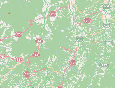
Can you see the green roads here in Japan. Acute problem at zoom 11. Obviously we could’ve tackled that in other ways but…
The rainbow of road colourings we had before presented all sorts of other awkward challenges and clashes. We’re trying for a cartographic style which shows a lot of different data (too much really. It’s actually hopelessly ambitious to try to make the map look good with all this stuff showing) by tuning down the range or road colours a lot, we’re make it less like a UK road atlas (cries of objection!) but we’re freeing up the colour spectrum, bringing us closer to meeting the needs of a global show-all-the-data map style.
Rest assured the change was discussed… massively… almost endlessly… Now you probably want to discuss it again, but please respect the hard work of those who have carefully thought through this change.
“Rest assured the change was discussed… massively… almost endlessly… Now you probably want to discuss it again, but please respect the hard work of those who have carefully thought through this change.”
I wanted to see what the thoughts were that led up to the change and the GitHub link you’ve supplied is very comprehensive. Thanks for that.
Nothing to stop people investigating layers that are better suited to motoring, or coming up with their own, if they (like me) want blue for motorways back, for example. This of course goes back to the point of OSM: the Standard layer is only one view and tries to do everything. Perhaps people will start to look beyond the default view and, although probably only a side effect of the change, might not be a bad thing overall.
Thanks for engaging with me here and on Twitter.
I don’t doubt that the change has been discussed endlessly and that there are lots of people who prefer the new style to the old one. What I don’t get was why the old one had to be binned, why it couldn’t have been kept as a native alternative layer, to give people the option as to which one they used.
There are all sorts of colour conflicts with the new scheme that are every bit as annoying as the old “trunk road in woodland” issue. No colour scheme is going to be perfect, but for me the old Mapnik style was about as close as it gets these days, certainly since Google decided that it wasn’t important for people to be able to read their maps. The Mapquest colours may be OK but the overall design is (IMO) hideous. Would having ‘Mapnik Classic’ and ‘Mapnik Standard’ both there have been too much to ask?
The problem is that doing it on the same tile server would multiply the load on the server by 2, or more if you want to keep more old versions (because this is not the first change and will almost certainly not be the last).
I think that graphics style on mapy.cz (that uses OSM data) looks MUCH better. I would prefer something like that for standard style.
http://mapy.cz does have a nice style. It really feels like looking at a road atlas (though not following the UK colours…. Shock. Horror. The motorways are not blue!) I wonder if they’d be capable & interested in being a featured tile layer on OpenStreetMap.org . But I notice it’s not just a raster map style. The site also shows clever interactive elements when you zoom right in.
The yellow for secondary highways conflicts with beaches:
http://www.openstreetmap.org/#map=15/-20.2811/-40.2846
I think that illustrates that some road colors are always going to conflict with something else.
Overall I am disappointed to see that so much effort was spent to redesign the map style and still a major problem remains: the possibility of distinguishing paved from unpaved roads.
This a very serious issue in most of the world and so far has been ignored for 7 years (!)
https://github.com/gravitystorm/openstreetmap-carto/issues/110.
https://trac.openstreetmap.org/ticket/1447
Rendering the map differently for unpaved roads cannot be more difficult than the redesign of the map style that was just implemented.
Simply use the HOT layer.
Pingback: The map you see on OpenStreetMap.org is changing | GeoNe.ws
I like the changes – the old map style was a bit of a gongshow of colours and the trunk roads in Canada were lost amongst the mass amounts of forest. The road and other colours are much more refined than they were before.
The only thing I’m not 100% about is the tertiary roads becoming white.
Overall, great job. The map looks very refined and much more professional compared to the Crayola of colours in the original version.
Haters gonna hate (and are usually the most vocal) 🙂
hehe “Crayola of colours”. That’s a good way of putting it
The same white color for tertiary and residential/service roads is a bit intrigating. We’ve lost that distinction (however the service roads are thinner and disappear faster in lower scales than tertiary roads and residential streets)
Only the pedestrian streets/areas are distinguised with grey, and private ways with greying dashes.
Something that is still too thick: dikes and floating equipements in marinas. At low scale, they completely fill the harbors with plain color, we no longer see that the area is almost completely sea or river water. Their thickness should depend on the zoom level and should be scaled appropriately (their effective width is typically about 2 meters only, but their rendering at low zoom levels is as if they were 50 or 100 times larger and completely covered the water, they collide together even if they are separated by about 20 meters, occupying less than a few percents of the water surface!). Note: this only affects those elements that were drawn in OSM database as lines, not those drawn as polygonal areas.
Rough estimations of widths for linear elements has been used for highways, rivers/canals, and railways. But all other linear features should be scaled based on their typical width: don’t use the same static stroke width for all zoom levels !
Pingback: Meklējam Ventspils šoseju | Latvijas OpenStreetMap projekts
I love the new style, it always seemed strange to see the motorways of the same color as a river, and the roads my red gave me the feeling that they were more important than the green, I feel great to have sought a gradient of colors to prioritize roads, and changes in the thickness also seems a success in general, all that makes me noise is tertiary blank, but may end up getting used. Congratulations from Argentina.
Glad I found this topic! Thought I’d done something wrong when I opened the map and it was all just red and white roads, much like Google’s sea of yellow and white.
Now switched to ‘MapQuest Open’. Welcome back, UK!
Almost thought you’d done a Google on me, they don’t even offer options, or care that their colours mean nothing to me.
Map looks weird now, with primary roads no longer being red it’s just not right! Can we have our map back please?
Hi OffTheChart,
lots of people asking for the same. Why need totally scrapping someting that is useful and important for lot of others.(Where are the Japaniese trunkroad-forest funs who should be happy with the new layout?Not seen even one in this topic)
Might Google have paid something to the OSM owners to downgrage,and dumb down it to same useless colors, like Google Maps has now.Who knows?
French OSM Maps still looks like the old good looking OSM default, have a look:
http://tile.openstreetmap.fr/
Hi Phillip Parr ,
check the French OSM Maps, they are much more useful in the UK,than the new default OSM layout.
Pingback: 耳目一新的開放街圖,換上全新地圖樣式 | TechNews 科技新報
Pingback: weekly 276 | weekly – semanario – hebdo – săptămânal – haftalık – 週刊 – týdeník – edisi
The next improvement for the default styles will be to separate the text layer from the the background colored maps with icons. It will allow selecting the displayed language.
For now maps are just showing a single language, which is generally the main or official language used in the geographic region. However for many users it is hard to read those texts or this caues problems in countries that are largely multilingual or with very significant ligusitic “minorities”.
In addition, most users in the world can’t read any text in the Asian region when they are written in Han sinigrams, or Kanjis+Kanas or Arabic, or even in Cyrillic or Greek.
It would really help if we had several (transparent) text layers, including at least one romanization
* In the romanized layer, various languages could be used as long as they are all written in the Latin script, but idelaly there should be seertal romanized versions for a few major languages spoken internationally: English, German, French, Spanish.
* As well in the Cyrillic text layer, transliterators could be used to convert from the default names written in the Latin script, but it could also use the Russian orthography when names in Russian are explicitly defined. In opther areas where the Cyrillic script is already the default, those names could remain in Bulgarian, Serbian, Macedonian…
* The Romanized layer should also consider displaying the English name instead of the default Arabic, Chinese, Japanese, Korean, Thai… or possibly one of the alternative languages whose names are already present in the Latin script (such as French in North Africa).
* For the sinographic layer, we could mix the default names in Chinese, Korean and Japanes without translating/transliterating them. But of course this layer would need to display the name=* default in Latin/Greek/Cyrilllic in other areas where there’s no translation available to Chinese or Japanese (it would be a bad idea to use transliterators from Latin/Greek/Cyrllic to Japanese kanas or Korean hangul or Chinese Bopomofo as those target scripts are only “defective” syllabaries with insufficient orthographic distinctions). Same remark about the Arabic or Devanagri layers
A set of prefered language codes (and set of transliterators), with priority lists for each layer could be defined. A few (~15) text layers could then be made available, the most important ones being:
– Latin script: English, French, Spanish, Portuguese, German, possibly also Dutch
– Cyrillic script: Russian
– Greek
– sinographic scripts: Chinese, Japanese, Korean
– Devanagari script: Hindi
– Arabic script: Arabic, possibly Farsi/Persian and Urdu
With those transparent text layers, the background tiles would no longer display any text (except possibly road references which are untranslatable).
Caveats:
* The slippy maps will need to load two layers simulatenously (this could have an impact on network performance). However the text layers could also load faster if they are not delivered as bitmaps but using SVG text (which could also embed clickable links, and users could also tune the fonts locally in their browser, for accessibility reasons, e.g. if they want higher font sizes or higher contrasts).
* Additional layers for text would require some storage space (the storage size for background images would be almost unchanged). But it will be very modest because at high zoom levels, most of these tiles are empty and in lower zoom levels there’s not a high density of texts.
Additional benefits:
* Text layers would be much less complicate and faster to generate, and any change in a name would not require redrawing the complex background tile. We would also see more consistant texts without truncations that occurs everywhere some rendered tiles are not synchronized.
* With reduced worloads on tile servers, “missing tiles” would load much faster (we would no longer suffer the famous “empty pink tiles”) as the background images would need to be regenerated much less often. Globally the navigation on the Slippy maps could be much improved in terms of global performance,
* This means that much less PNG tiles will need to be regenerated. Tile renderers could have a lower work load. That gained workload will be used insteaf by other tile renderers for text layers (which could be made on other servers, allowing more balancing/distribution of the work load).
* Even if text layers are generated as bitmaps, they would take much less storage space then background tiles. They could also be cached on OSM tile servers with a reduced cache size because they are more easily regerenated on demand.
Note: for compatiblity with existing applications (or for faster performance on mobile internet clients that could not like having to make two HTTP requests instead of one per tile), the tile servers could also return a single combined layer “on the fly” by combining the background tile and the text tile into a single image: such combination does not require any workload on the tile renderer and can use its own local caches to keep a local copy of the source background tile and the source text tile, and then deliver the result to the fonrtend proxy caches: applications currently displaying OSM maps would not need to be modified.
Once again, the workload for these “tile combiners” could be separated and more easily distributed across more servers (that would be easy to deploy on small servers with modest resources, as these “tile combiners” do not need to perform any database request, they just need to perform two HTTP requests to distinct tile servers and return a combined image to the front-end Squid proxies, the operation being purely graphical). These “tile combiners” could be deployed easily and locally in the 14 existing colocation areas where Squid servers have been deployed, and they could reuse the caching capability of those existing Squid servers for querying the separate background and text tiles (without any significant cost in terms of total access time for web clients using the slippy maps).
Depending on the area of the viewing client, when they query tiles for their slippy map, it will be most often in the same script, and most text tiles will be in the same linguistic version. for example text tiles renderers in Chinese would be active mainly on the colocation area defined for Chinese clients, text tiles renderers in English would be mainly active in the US or British colocation areas, text tiles renderers would be mainly active in colocation areas defined for France, Belgium, North/Est Africa or Canada, text tile renderers in Portuguses would be mostly active in the colocation area defined for Brasil or Portugal. But all colocation area would be able to render the 15 sets of text tiles, or 15 sets of “combined” tiles.
With all these ideas, we could have a more usable slippy map for everyone and users would benefit more choices for the language to view (even if there will remain untranslated/untransliterated texts). Maps would be readable by more people around the world.
Additional note: please restore the possibility of displaying a scaling bar widget in some corner of the map. This should be an option box in the map preferences panel. It is needed to have a rough virual estimate of the distances. That horizontal scale should be based on a mesure along the geographic parallel crossing the middle of the whole displayed slippy map area.
Any map without a scale is NOT a true map.
Optional: add a second scale for the vertical axis (but at low zoom levels, the geographic scale is largely non linear, so it should not be used at low zoom levels where non-linear differences are too much important. But for zooms levels 6 and higher, both scales are usable everywhere for estimations and are roughly equivalent (so only one scale is really needed).
Optional: add a measurement tool allowing to measure the geographic length of a segment by clicking on two selected vertices (optionally along a handdrawn polygonal path with more clicks) and a button to reset/clear the measurement line. In the preference panel, allow the user to select the measurement unit (meters/kilometers, US feet/miles, imperial British feet/miles) and keep it in his preferences (if the user is connected) or in some site cookie.
Awesome! Its actually amzing article, I have got much
clear iddea about from this paragraph.