Author Archives: Steve Coast

Crisis Mapping Conference in October

Mikel visited your city and now a earthquake-tornado-flood-tsunami hit you.

Then godzilla came to finish you off.

Who you gonna call?

Crisis Mappers!

Now, with Crisis Mapping: The Conference. Looks like it should be pretty interesting post Haiti and all the awesome work done there, and every crisis mapper gets a fee Jeep Wrangler:

2nd INTERNATIONAL CONFERENCE ON CRISIS MAPPING (ICCM 2010):
HAITI AND BEYOND

Leveraging mobile platforms, computational linguistics, geospatial technologies, and visual analytics to power effective early warning for rapid response to complex humanitarian emergencies.

BOSTON, OCTOBER 1-3, 2010

OSM Routing

Interesting post here: http://blog.telemapics.com/?p=245 on using OSM as an outsider

“For many of us, it seems so difficult to discover things about OSM, its data, and the use of the data. Maybe I just need to spend more time reading their Wiki (guilty). However, I admit that I am confused about OSM licensing practices and liability issues. Every time that I start to research these issues, I get a headache. While I think I understand the limitations of the license to use OSM data and why these “carve-outs” are necessary, I find it difficult to understand how to use the data to any commercial advantage and wonder if that will limit the usefulness of OSM’s contribution.”

Of course there is no confusion on using proprietary data – it’s very clear how expensive and wrong it is, and how they accept no liability.

Essentially Crappy Technology

(Note: another thing I wrote a while ago)

In July 2007 at the O’Reilly Open Source Convention in Portland, Oregon, Tim O’Reilly (publisher, conference organiser and seer) and Eben Moglen (general counsel to the Free Software Foundation) banged heads on the subject of Web 2.0, and the future of Free Software when nobody cares about software any more. Why would you not care? Because you’re using online spreadsheets for free instead – software as a service. Various business models (say, Microsoft and Excel) currently are based on software as a product.

At the beginning of their exchange Tim pointed to Eben’s disbelief of the ‘Web 2.0 era’. Eben responded

“… Look the web is a data storage system, distributed and powerful because it’s distributed. Full of essentially crappy technology which will be replaced.”

Wikis are definitely essentially crappy technology.

But do I mean that’s a bad thing? In the whole, no. The meaning behind the phrase lends itself to simplicity. If you look at the standards and protocols that run the internet, they’re generally pragmatic simplicity enshrined. Or, the quickest and simplest thing that will ‘just work’. They were built on-the-fly to explore what was possible and in many cases aspects of widespread protocols taken as standard today were mere design experiments or accidents, perhaps even the result of a chat over a pint of beer.

This was all in part by design as most of the protocols are in layers which build upon each other. They can purposefully be small parts of a chain to accomplish things, and in many ways act like swiss-army knives in that they have multiple uses. As an example, consider someone delivering you a package. It doesn’t matter what road the firm drives down to deliver it, or what the model of truck is. Probably the government provides a base road network, the delivery firm chooses a truck and the driver chooses a route. And you, of course, choose the package.

The internet works sort-of similarly to that. Someone owns some cables, someone owns boxes to send magic signals down those cables and you choose the web page being delivered. But it works deeper down too. The magical signals are layered – someone designed a way for two computers to talk to each other with one cable, then someone else designed a way to send messages between any number of computers, but only using the protocol each individual uses to talk to each other. Then someone else uses this new protocol to ask questions of remote computers, in a special new format, a new protocol. Questions like ‘do I have any email?’

Wikis evolved like that. The simplest possible thing you can do is allow someone to save a text document on to a server. Then you let people view that document. Then you do things like say “if there is a line surrounded by equal signs, then it’s probably a title” and the software magically turns things like =My Nice Title= in to My Nice Title. It’s called a markup language.

Magic. But then, what about if I delete your title accidentally or on purpose? Then the system needs to store each edit as it happens, along with who, when and why the edit was made. This way, you can browse back over edits and see the evolution of something like a page in wikipedia.

Wikipedia revision history for the OpenStreetMap article – the who, what, why and when.

If you play with wikis today, you will find them like a lot of the tools that run the internet – essentially crappy. The basic application hasn’t changed in years for text wikis, for example Wikipedia itself. Using MediaWiki, the software behind Wikipedia, hasn’t changed much in many years – the innovation in some ways stopped.

Don’t get me wrong, development goes on. A lot of effort has been put in to scaling, that is to making it go from handling 3 users and a cat to 20 million readers a day. But it’s still the same wikipedia. If you use many other wikis and things like Google Docs today then you can use WYSIWYG

tools to add bold text, titles and so on. No strange markup. But wikipedia hasn’t moved with the times. Whether it needs to is debatable.

If you and I edit the same article at the same time then we may have made conflicting edits. If this happens, the system effectively gives up and shows you the differences. That’s essentially crappy, but it works.

It will never work

(Note: this is another thing I wrote awhile ago, I will post more of them just to get them out the door)

I was in a hospital once and noticed a sign encouraging doctors and nurses to use an “evidence-based approach” to care. It’s a bit scary to think they might be using dice to decide how to treat your broken leg, but hey, it’s a possibility.

One of the things that advocates of wikis get asked repeatedly is whether a wiki is trustworthy. Surely if anyone can edit then they will add nonsense, or get things wrong. It’s almost not worth debating the point if you take an evidence-based approach. Wikipedia works

Honest, people use it every day to look up all kinds of things.

You can be in an auditorium and get this question. Is it trustworthy someone asks, and a sea of faces look slightly panicked – maybe it really is turtles all the way down?

But you can easily flip it. You ask the audience how many people use wikipedia, say once a week? A cornfield of hands goes up. Then you ask how many use Encarta? You might get some people own up to that one, but it’s not like Encarta is a slouch – we’re talking about the people who broke Encyclopaedia Britannica and their business model. (Note: this was written when Encarta was alive).

Which is not to say wikis are 100% trustworthy. But they’re not even designed to be. Britannica never was 100% tustworthy (or is) and nor was Encarta. There are always mistakes. If you really want to know, with accuracy, how tall the Eiffel Tower is then go climb it. It’s a lot cheaper to stay at home and get the information for free from wikipedia though, with say 99.999% certainty or whatever the figure turns out to be.

pastedGraphic

This is what’s called ‘versioned information’. You have one version of the information, which has some ‘quality’ and zero ‘price’ from wikipedia. (I use price and quality in quotation as it’s a bit of a hand wavy argument. A guess is really zero price, but wikipedia requires a computer, internet, electricity, fingers… And of course ‘quality’ is a relative term here). Then you get other versions at other price/quality positions.

You have a higher price version sitting on a shelf at your local library or book store in a book – higher price as you have to go to the library or buy the book. That higher price might reflect the higher accuracy. In a market of information, there should be many choices on the price/accuracy graph and it’s up to you to choose which one you want.

To go though the example, a guess is free… you’ve seen the Eiffel Tower in pictures so you know it’s roughly a couple of hundred metres tall. Next ask your 10 friends when you see them for lunch and average their opinion. Next, go ask wikipedia. Next, for all we know the Britannica article was written by the guy that built it, but then you have to go find a library or buy a book. And very last you can fly to Paris which allows you to be as accurate as you want but it comes with a associated cost.

It turns out that lots of people choose wikipedia. The small increase in quality, if it exists, to go buy or read a paid-for encyclopaedia (or fly to Paris) generally does not appear to be worth the large increases in price. Nw imagine the Y axis on the above graph being the number of page views or attempts. There will be lots of guesses, a few people asking friends, a huge number viewing wikipedia and basically nobody relying on Britannica or actually surveying the tower.

This is what happens, more broadly, out in the real world. Information is versioned on quality, timeliness, availability, presentation and so on despite often being the same information. Stock quotes are more expensive if they’re live than 20 minutes old. Books are more expensive if they’re new (hardback) than old (paperback).

PS it’s 324 metres, or so says the notoriously inaccurate wikipedia (which anyone can edit!)

Herding Cats

(Note: another thing I wrote a while ago)


 The book ‘producing open source software’ by Karl Fogel has a wonderful cover (pictured). It shows many smaller arrows of varying sizes all pointing to the right, and a larger arrow in yellow that it seems to me is the implied effect. If you have all your horses pulling in one direction, you can move a house it seems to say.

The image comes to me like that because it reminds me a lot of various diagrams you would make in physics class. If the ball hits the other ball at such and such an angle, where does the shoe drop? That kind of thing.

It’s a beautiful image, and it’s the one I had of Free/Open software before I got involved in it. All these people pulling in the same direction to make an encyclopaedia, or an operating system. But I tell you, it’s very wrong until you hit maturity.

First, the size of the arrows. The distribution of effort in collaborative projects can vary an awful lot. When a project starts its effort is often distributed like this:


 Stage 1: One man band Effort / Frequency graph

What the hell does that mean? It means that one person is putting a lot of effort in. It’s low on the frequency scale (there’s only one person). It’s high on the effort because they’re doing all the coding, making the website work, replying to email, battling rival projects with dumb ideas, coming up with better ideas and so on. It’s the most critical phase of a projects life and it’s why so many projects are synonymous with the people who started them. Or at least the myth of who started them as the successful projects attract people willing to claim credit for things that went right. Linux, Linus. Wikipedia, Jimbo Wales. Mono.NET, Miguel de Icaza. Debian, Ian Murdock.

There are thousands of smaller projects still effectively run by the guys who started them. File utilities, mouse drivers, deployment tools, image tools and so on. When they get big in many cases they retain their founders because if they don’t, they tend to fuck up. Committees are not good at running large distributed projects which rely on peoples free(!) time. Benevolent dictators tend to work out well, and when they don’t the project forks or fails and a hundred other flowers bloom.

Think about Debian vs. Ubuntu in this context. And if you have no idea what that means, it’s not important.

The next stage for these projects hinges a lot on the temperament of the guy running it. Often they won’t accept new ideas, or they’re only doing it for publicity (which often behind the scene means money). Or they get bored, or they want to control everything, or they don’t have the time. There are millions of reasons. When OSM started there were two existing similar projects I knew of. One was geowiki.com started by Richard Fairhurst and friends. It was (and is) a beautiful site, arguably required a lot of effort to make and didn’t have any community participation (mailing lists and so on). It stagnated because nobody could get involved and all the data, code and tools were locked up.

Second, there is free-map.org.uk which is run to this day by Nick Whitelegg. It is very focused on the walker. Here in England we have a large community of people who walk all over the place on rights of way (which often cross private land). Free-map catered to those users and Nick throws a lot of effort at it, but it remains mostly Nick because of its focus. Nick has thousands of great ideas but only Nick to implement them. In his spare time.

When OSM started it was light years behind these projects but like them it essentially rejected the geo-dogma. Today, Nick and Richard are key contributors to OSM.

After the first ever OSM talk, freemap was set up. It was very top down, using all the latest standards and it got basically nowhere despite good intentions because it concentrated on technology, not community.

  • Community is everything. OSM only ever sought to make maps. Not the prettiest maps. Not the best maps. Not the fastest maps. Not even maps that worked in 3 out of 24 hours. What it did (and does) is make map making as simple as possible both technically and socially.
  • The second corner stone was getting out of the way. All the code was open. All the data was open. It was as open as you could possibly make it, barring privacy constraints.

These two things were the key, and what separated OSM from the other projects. They’re kind of fairly easy to posit and talk about and wave around. The third pillar is not.

  • Only let the people doing actual work talk. Everyone else can bugger off.

OSM for a good two years was full of people with brilliant designs for space ships. I love space ships. I love flying cars. I am still disappointed every time I see a DeLorean that it doesn’t vertically take off. But a space ship requires highly paid experts from NASA to come build it. And technicians to make sure it’s ready to fly. And a ground crew in case there’s a problem. These are all wonderful things, but rarely do you get them for free in someone’s spare time.

OSM on the other hand was Buzz Lightyear’s cardboard spaceship. It looked like a space ship. If you threw it and squinted for a few seconds before turning away then it kind of flew. It was held together with string and glue. It was a dog. But, crucially, it worked. Anyone could contribute to it, anyone could have the data. It was the only project with a simple API that anyone could talk to.

Continually there were calls to strap jet engines on (this was a mooted feature for the Space Shuttle by the way) or inter-galactic warp drive. Mostly these people were told to bugger off unless they designed, built and strapped on the rockets.

Why such a harsh attitude? Because building something like OSM is hard. It requires love and time and attention over long periods of time. Therefore nerves can fray when a space cadet lands next to your cardboard ship and tells you its all wrong because they read it in a book somewhere, and it says so there. If you have 3 space cadets arguing 3 different warp drive designs, make a sail and tell them all to bugger off.

So back to the arrows.

At this stage, a project still has a main leader but it has a bunch of users and the odd person adding significant amounts of code. OSM was slightly strange in this regard as the users are in a sense much more important than coders. They’re out there in the rain on a Sunday, for free, mapping some awful housing estate. Without them out there, you have no map. Therefore the simplest thing that could work is OK, so long as you have people out there mapping.


 Stage 2: Lumpy Effort / Frequency graph

And so we arrive at stage 2. The founder remains on the left, being one person throwing a lot of time at it. Next there is a lump of a few people doing key things. In OSMs case this was a guy called Imi who made an amazing map editor called JOSM, a guy called Andy and one called 80n (yes, really) who did a lot of mapping and started to put together OSMs ontology system. It doesn’t have an ontology but it’ll be our metaphor for now. Further up the frequency scale there are many people out doing small things. Mapping some streets. Fixing the odd bug. Publicising the project.

Notice that the area of each blob on the graph represents, roughly, the amount of work going in per unit time. Notice that the two right-hand blobs are larger in area than the one on the left. They are, in total, putting more work in.

There is a downside – the work is lumpy on the right. Someone maps an entire town and then disappears. Someone writes an entire editing suite and then gets a girlfriend. So the bars are shifting in all directions as time goes on. Who knows what the project will look like next month?


 Stage 3: Effort / Frequency graph smoothes out to a curve

Eventually the distribution is large enough because it has so many people, that it smoothes out.

While not mathematically correct, this graph is often called the long tail. The effort of a few full time individuals on the left is equal to thousands of contributors spending a few minutes a day. OSM isn’t there yet, but it’s getting close. That leads to a specific set of arrow lengths, many short ones and a few bigger ones.

What does this say about direction, too? Revisiting our stages, I think the first two look something like this:


Yes, some of the lines are pointing backward.

So in stage one, you have your one founder. Stage two attracts people who think the whole thing is crazy, or start rival projects – hence they’re pointing the other way. You have people with different focuses, different ideas and so these are at an angle. Different sizes as they’re throwing varying sizes of effort in.

Last, as the graph smoothes out and the ideas and technologies are accepted you’ll see something much more like the cover of that book.

Nice blog post by someone getting started with OSM

Over here: http://frogplate.net/blog/amateur-cartographer.html

“Now Google Maps, and my Navman SatNav have a typo in the name of the street in which I live, and so on reaching home I checked the OpenStreetMap site to see if they had got it right. Initially I was disappointed to find that, although my street was on the map, it and a number of other local roads weren’t named. And then I realised that this was my opportunity to use my lunchtime walks to make a small contribution to the common effort. The next lunchtime found me setting off with a screen print of OpenStreetMap.org, a pen and a GPS receiver.”

New design concept for openstreetmap.org

Together with a talented web designer I’ve created a concept to update OpenStreetMap’s front page which you can see live over here:

Pastedgraphic-1

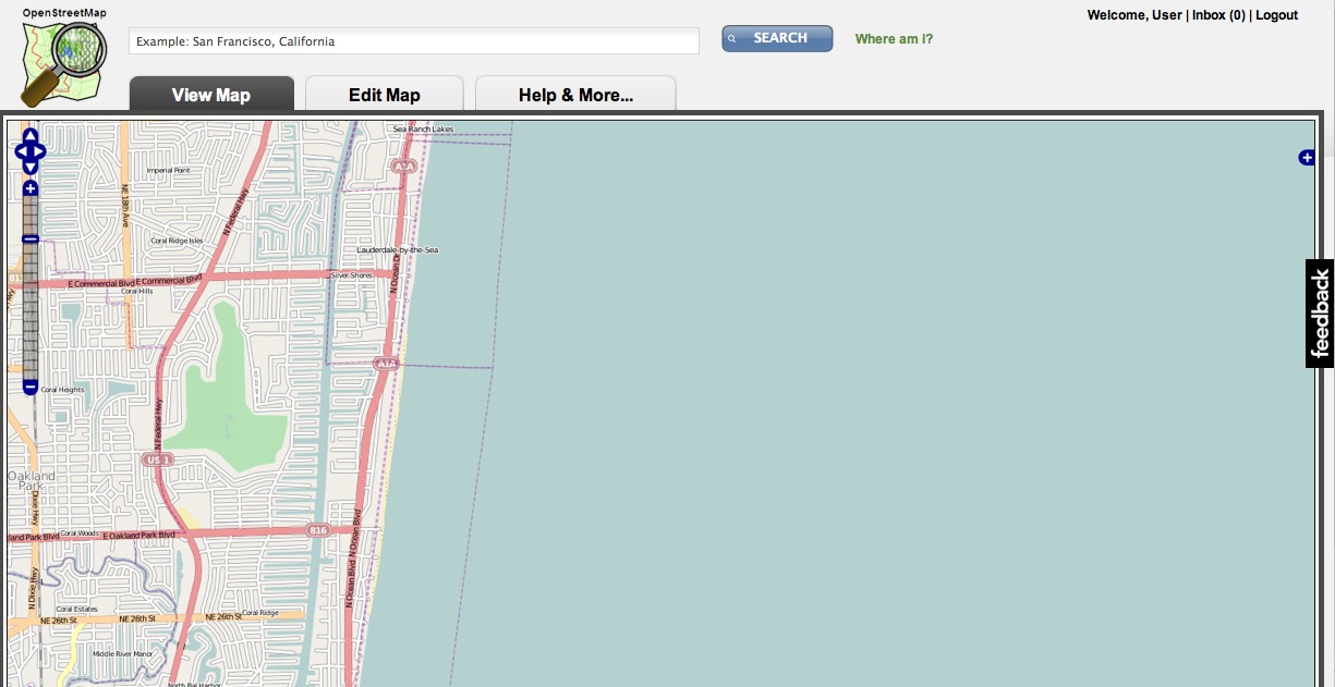
The basic theme should be familiar. There is view/edit tab to view and manipulate the map (which have dummy images in them) along with login and user info, a search box and so on. It’s cleaned up a little from the existing page. I will highlight the main innovations.

First, a “Help & More…” tab:

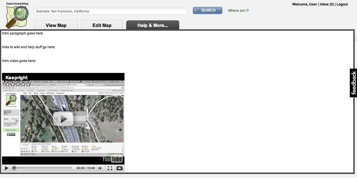
Pastedgraphic-2
Although in rough mockup form, this tab shows a brief introductory paragraph to the project, links to common resources like the wiki and mailing lists and a prominent youtube video. This would be a video introduction to the project pointing out the basics and how to find more videos and resources. It would be short, perhaps 2-5 minutes long. It would look nicer than the current mostly blank white space.

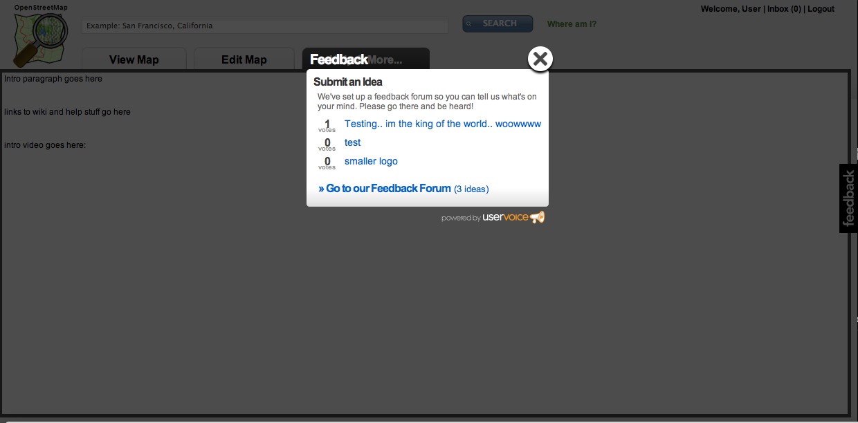
Secondly the feedback tab on the right, when clicked, expands as shown:

Pastedgraphic-3
Powered by uservoice, this is an incredibly simple system to add bugs and suggestions to the site, and allow people to vote on them. Please use it to add any feedback you have on the site design (you can see the ideas and votes etc over here on uservoice too).

There are two issues to highlight with the feedback system. One, it’s not trac, our existing system. No. If we’re going to scale the project to the people we need to, the people using it Haiti or my mum, then we need to make giving feedback as simple and easy as possible. UserVoice is almost there and trac is nowhere near. Yes, you need another login with uservoice but they allow you to log in using many existing systmes (like twitter).

The second issue is that people may see a bug on the map and click feedback and try to tell people about it there. Actually, this is better than our existing feedback system for map bugs, because it doesn’t really exist on openstreetmap.org. I would love the map javascript to be able to tell the uservoice the current map extent so that people can fix the bugs this way. But right now I don’t see an easy way to do it. We could also implement our own feedback system which looked a lot like uservoice but had some map bug reporting in it too. That would be ideal but I’m not going to rely on the community as the first pass to come up with anything that user friendly, because lets face it, open source is awesome at many things but it’s not usually user interface design.

What have we lost in this design? The donate link, the into paragraph shown to logged out users and the thanks to a few key supporters. The last one I propose could be a small piece of text somewhere that rotated amongst key supporters chosen by the OSMF. The rest could reasonably be dropped or added to the “Help & More” tab.

Lastly, with a prominent tab we can, if it makes sense, replace the default view from the map to the “More & Help…” tab. Perhaps once you have an account, you can change the default to be either the map view or the help tab. This would do a number of things like cut way down the number of tiles shipped by the tile servers by default, and present a really clean and informative “get started” page to new users. Again, it doesn’t have to be the case, but it might be nice to try.

So, what do you think? Please get involved on the feedback tab mentioned and remember that this is a concept and subject to change with your input. Think about what could be added or subtracted and very importantly how we can begin to pull in much more feedback from the users of the tools and the map so we can close bugs more quickly and add the features they really want.

Note: Do I want to nuke the existing design from orbit tomorrow? Absolutely not – this requires a lot more work, feedback and implementation before we actually update the existing design.